Tuesday, 22 October 2013

Research and Planning- Analysis of Music Magazines Front Covers

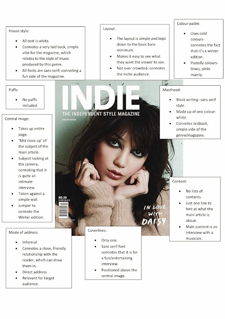
The two magazines I selected to analyse are both from the music genre of indie/alternative. 
The magazine has been published by Clemens Steinmüller, for the target audience of alternative music fans, most likely between the ages of around 17-28.
 Vice is another indie/alternative magazine on the market at the moment. This magazine is an independently  published brand. The target audience is, again, fans of the alternative genre, between the age range of around 15-23. The audience will most likely be students.

Friday, 18 October 2013

Institution research (2)

Institution research


Initial ideas

What type of magazine do you want to create?
For my music magazine, I would like to stick to the genre of Indie/Alternative.

Why?
Because this is a genre which I am particularly comfortable with. It is also a genre which has a lot of unsigned bands and artists, which is something that a lot of people enjoy reading about. The Indie/Alternative scene is quite niche, which is the type of audience I would prefer to aim at, rather than making it a broad target, like in genres like pop. Since I like this genre, I will know the type of things to put in the magazine to appeal to the audience.

What would make my magazine unique?
My magazine would not be focusing on mainstream artists- instead focusing on unsigned bands and artists that no one has discovered. It would be spotlighting the up and coming acts of this genre, which is something that the readers of the magazine would want to know about.

What to include?
  1. Articles and reviews on up and coming (as well as pre existing) bands and artists
  2. Charts
  3. Festival/gig guides
  4. Lists for the best up and coming artists:
Bands to include:
Unsigned bands like;
1984

0 Not My Day

And signed bands like;
Young the giant


Colour pallet?
The colour scheme will mainly consist of darker colours, mixed in with some brighter colours;
  • Reds
  • Black
  • Whites 
  • Greys
  • Greens
  • Yellows

Introduction to the main task and action plan

For this task, I must create a front page, a contents page and one double page spread article for a new music magazine.For this task, I have to manage my time well, so I intend to follow the following action plan;

Week 1:

  1. Initial ideas for my music magazine
  2. Institution research
  3. Analyse two front covers from my chosen subgenre.
Week 2:

  1. Analyse two contents pages and two DPS from my chosen subgenre
  2. Begin to develop my pitch


Week 3:

  1. Develop and complete pitch
  2. Complete further research for chosen subgenre

Week 4:

  1. Present pitch and audience feedback on blog
  2. Complete magazine mockups
  3. Produce a style sheet which reflects the brand identity and house style of the magazine
  4. Organise models, locations, props, photoshoot and blog process.

Week 5:

  1. Develop front cover: experimentation with layout, colour, font, language, photos

Week 6:

  1. Continue developing front cover
  2. Make adjustments to magazine design according to feedback

week 7:

  1. Design contents page
Week 8:

  1. Design and develop double page spread
  2. Make adjustments to magazine according to feedback

Week 9:

  1. Develop double page spread
  2. Adjust magazine according to audience response

Week 10:

  1. Finalise design of all pages
  2. Begin to draft evaluation

Week 11:

  1. Evaluation

Week 12:

  1. Develop evaluation

Week 13:

  1. Complete evaluation

Week 14:

  1. Complete evaluation
  2. final blog check


Tuesday, 15 October 2013

Monday, 14 October 2013

The Evaluation

 In what ways does your media product use, develop or challenge forms and conventions of real media products? 
Through research, I found that all student magazines generally consist of the same structures and conventions. Most of the magazines I researched tended to have one central image on the front cover which took up the majority (or all of) the page. This image was in most cases of a student (or a few students) from the college/university looking directly at the camera whilst smiling. I adapted this idea for my magazine cover by taking the concept of using students from the college, but engaging them in an activity that linked to the main headline of the magazine. In my research I also noticed that not a lot of student magazines like to crowd their front page with distracting headlines, coverlines, puffs or over-the-top mastheads. I tried to incorporate this into my own work by just putting in the necessary elements. These consisted of 1 puff, 4 coverlines and 1 bold masthead. I also took on board the idea of using the text font to connote the magazines tone. I used fonts more associated with sans-serif to show that my mode of address was not formal. 
In some ways, I have pushed away from some other student magazines. Mine is a lot more simplistic, with a less energetic and more relaxed tone. I stuck to a rather basic brand identity, with a colour pallet of just red, black and wite (excluding the central image). This goes along with the conventions of a real magazine, because it uses these colours to distinguish itself from the rest of the magazine on offer.

How does your media product represent particular social groups?
My magazine was designed to appeal to an audience between the ages of 16-20. It helped that I am in that age range, so I was on a level of understanding of what would be wanted in a magazine, but I went through audience research with others in this age group to see how I could better angle the magazine at the target audience. By doing this, I found out many things that I wouldn't have considered putting in the magazine. For the central image I used regular students, which provided a connection for the reader that would attract them to the magazine. The clothing was not flash, and the whole atmosphere was relaxed and welcoming- something students look for. 
The price of the magazine was £1. I decided on this because since my target audience is students, they most likely will be very short on money. They won't want to spend out a lot of money on a student magazine, but during my audience research I found that they would be willing to pay £1.

What kind of media institution might distribute your media product and why?
The magazine would most likely be sold in the college, as it is about the college itself. The magazine would contain a lot of useful articles etc. about college, so that would be where you would most likely be able to sell the issue. Since the magazine isn't expensive, students would most likely buy it as something interesting to read between classes/homework. Also, if they see others around college reading it, the students are more likely to decide to buy it to see what the fuss is about- peer influence.

Who would be the audience for your media product?
My magazine is generally aimed at 16-20 year old students- so in the E demographic. It is aimed at both genders- there aren't that many gender-exclusive articles. They wouldn't have to pay out for bills etc. like other demographics, so they would have enough money to be able to spend out the £1 on this magazine. Teenagers tend to be quite loyal in their buying habits, so that added with their access to money means they would be reliable to buy the magazine. Really, the target audience belongs to the 'mainstreamers' psychographic. 

How did you attract/address your audience?
The front cover of my magazine is quite bold. The red and black stand out above the image which attracts the readers attention to it first. This boldness reflects on the reader, as students tend to think of themselves as quite individual and unique. When they see this idea presented to them like so, they have an unconscious link which makes them feel that this magazine is for them.
The central image is a lot less eye catching. It consists of cold colours like whites and blues, which reflects the fact that it is meant to be a winter edition. The colours match those stereotypical for that season. 
I used the same font for the front page of magazine. This creates consistency and doesn't distract the audience from what I want them to see. The text is all in black, which catches the readers eye, and when put against the red makes reading easy for the reader, so they can scan the page with ease. 


      What have you learnt about technologies from the process of constructing this product?
      For the process of creating this product, I have used multiple technologies. For the planning process of this product, I used Blogger. I already had prior experience in blogging, so there wasn't much to learn there. However, when it came producing the final product, I used many more examples of technology. I created the magazine with Indesign. This was a completely new program, so I had to learn how to use it as I went along the process. Once I got used to the layering system, the program was rather easy to use, however I did find creating the puff on my front cover quite tricky. 
      I also used a camera, and the program; 'photobooth' during the design of my magazine. These were both incredibly easy pieces of technology to use, however while working with the camera I learnt about the different shot types- like the medium-close up required for my central image, and how camera angles can effect the meaning behind an image.